


HOT PRODUCT | LOW STOCK
Unic 17 Safety, Mottled Gold "Waves" Overlay, #2 14ct Utility Pen Co. Nib
Unic 17 Safety, Mottled Gold "Waves" Overlay, #2 14ct Utility Pen Co. Nib
📒 History/Provenance
Beautiful mottled ebonite overlayed with a gold-plated metal overlay in the distinct waves chased pattern. The overlay is commonly seen on many of Unic's pens of the era and the pen itself was found in a beautiful Unic gift box (included with your purchase).
The Utility Pen Co. Chicago nib #2 might have been original or a replacement given that this pen was likely an export to the USA given it's lack of hallmarking besides the model printed on the finial turning knob.
🧪 QA & Recommendation
Extremely precise and responsive nib that is a very fun daily driver. Writes like a soft manifold with the option to flex, has a very nice and juicy matching mottled ebonite feed.
Tested on Rhodia 80gsm A5 pad and Pelikan 4001 Royal Blue.
🔧 Ebonite Restoration Commentary
Strong model number imprint on rear finial.
Gold-filled overlay has some microscratches, with one deeper scratch near the bottom of the cap overlay.
Ebonite rejuvenated and overlay lightly hand polished, "softness" of ebonite restored.
Nib heat set and tuned for flex/smoothness.

Technical Specifications

Technical Specifications
Brand: Unic
Model: 17
Production Year: 1920
Material: Gold Metal Overlay
Trim Color:
Nib Size: 2
Nib Material: 14k gold
Nib Grind: EEF, Cursive Italic
Nib Flexibility: g
Line Variation: - (11.4x)
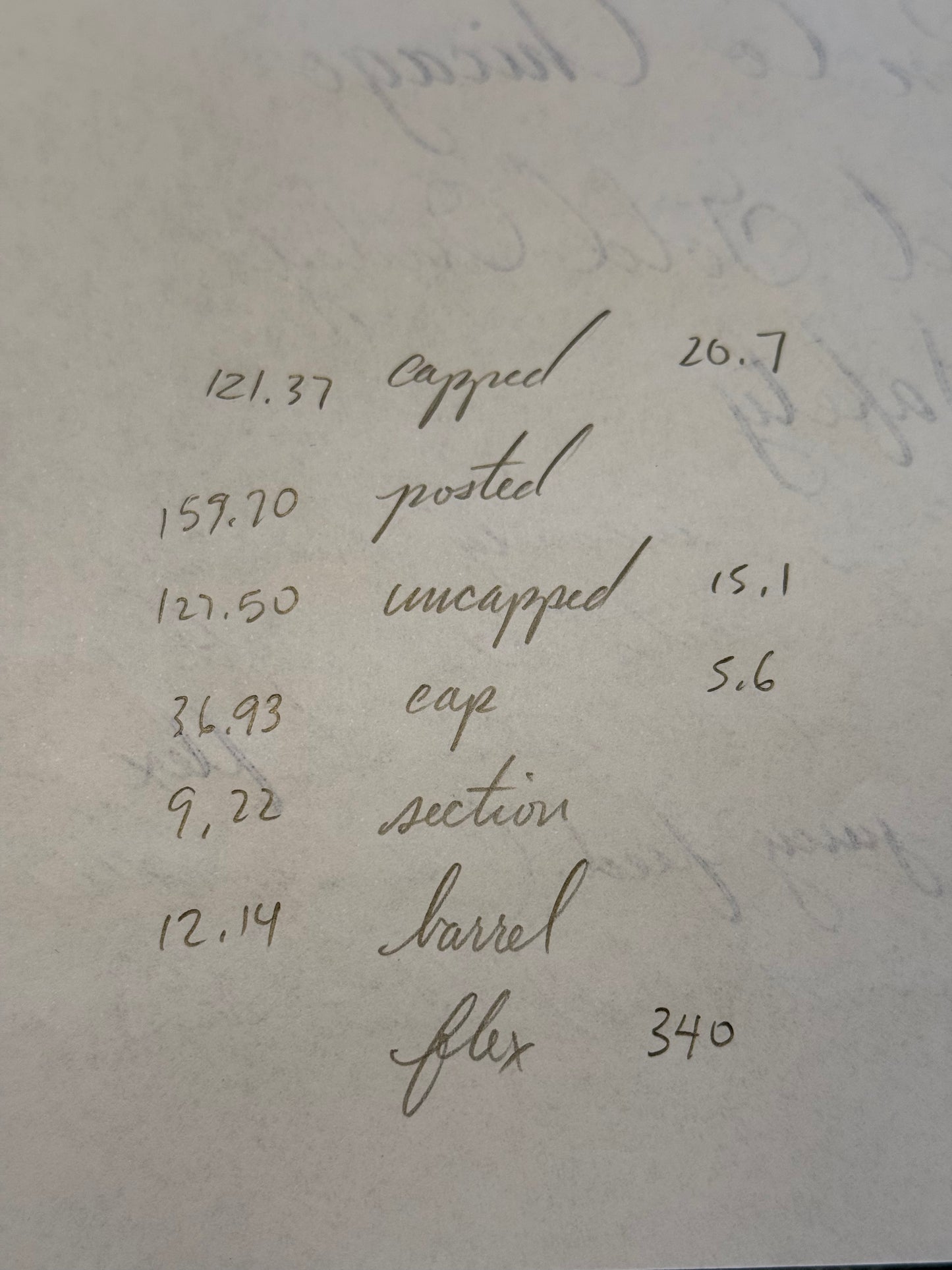
Pen Length: 121.37
Pen Grip Section:
Restorer: Heron's Mooncake
Restoration Grade: B+
Couldn't load pickup availability
Unic 17 Safety, Mottled Gold "Waves" Overlay, #2 14ct Utility Pen Co. Nib
Get it between - and -.


Appendix for Listing Details
Sweating the details is fundamental to understanding, appreciating, and knowing the peice of history you have in your hands.
All pens are filled and tested, not just dipped in ink, which does not reflect writing characteristics whatsoever.

Line Variation Standard
Different restorers have different standards for line sizing and especially for vintage pens, the printed tipping size will not always be accurate due to repairs/grinds/etc. Please use this as a frame of reference for consistency.

Flexibility Standard
Nib flexibility is such a controversial topic, but there needs to be some level of consistency so please take this table as a frame of reference for my restorations and as someone who is writing in a calligraphic/spencerian style of cursive script. Without objective measurements, flexibility terms such as wet noodle are useless as someone with stronger forearms and grip strength will make even manifold nibs into a wet noodle.

Restoration Ratings
These are guidelines incorporated from various online sources not limited to Reddit, David Nishimura, etc.
