


HOT PRODUCT | LOW STOCK
Unic | 1 Safety | Red Mottled French Ebonite, GF Waves Guilloché Overlay | 18ct #2 Flex
Unic | 1 Safety | Red Mottled French Ebonite, GF Waves Guilloché Overlay | 18ct #2 Flex
Bright red mottled ebonite under a gold-filled waves guilloché overlay, the style Unic built its early reputation on.
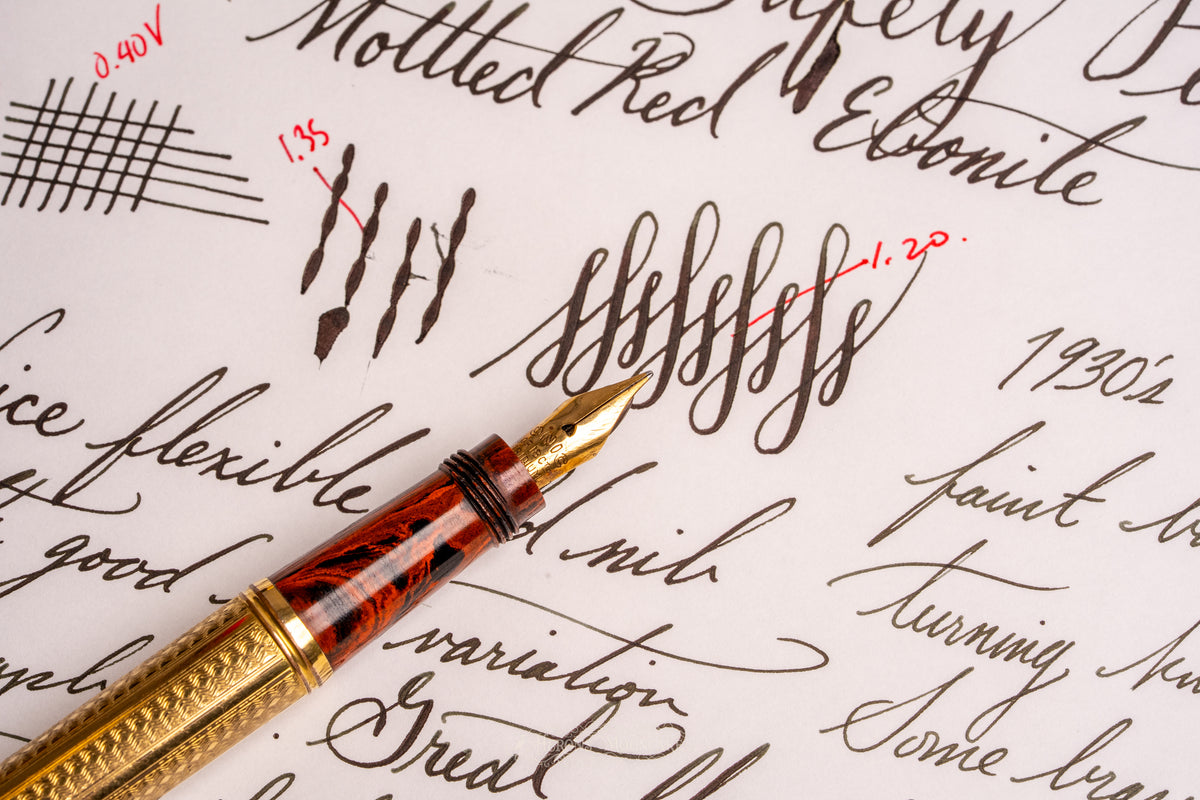
The #2 18ct nib is a soft, snappy writer. Unflexed you get a fine line with a touch of stub character, 0.35mm across and 0.40mm down, and it opens to about 4x that under firm pressure. Not a super wide flex, but a soft one with good line variation, clean snapback, and flow that keeps up the whole way.
The model imprint is on the rear turning knob, faint but legible. Unic worked in Paris from 1919 into the early 1960s, and overlay safeties like this one were their specialty in the first decade, ebonite bodies under silver and gold. Surprisingly little was ever written about the company for how much they produced.
Grade B. The ebonite is in great condition with bright mottling, and the overlay shows some brassing, mainly at the lower finial end. It's subtle, and you won't notice it in normal use. Fully disassembled and rebuilt with a fresh cork seal and o-rings, fresh silicone grease through the mechanism, cycles tested, nib heat-set and tuned.
Tested on Tomoe River 68gsm A5 white with Pelikan 4001 Brilliant Black.

Technical Specifications

Technical Specifications
Brand: Unic
Model: Unic 1
Production Year: 1930
Material: Gold Gold Metal Overlay
Trim Color: White
Nib Size: 2
Nib Material: 18k
Nib Grind: FM
Nib Flexibility: g
Line Variation: - (3.86x)
Pen Length: 117.52
Pen Grip Section:
Restorer: Heron's Mooncake
Restoration Grade: B-
Couldn't load pickup availability
Unic | 1 Safety | Red Mottled French Ebonite, GF Waves Guilloché Overlay | 18ct #2 Flex
Get it between - and -.


Appendix for Listing Details
Sweating the details is fundamental to understanding, appreciating, and knowing the peice of history you have in your hands.
All pens are filled and tested, not just dipped in ink.
Abbreviated Filling Instructions

Line Variation Standard
Different restorers have different standards for line sizing and especially for vintage pens, the printed tipping size will not always be accurate due to repairs/grinds/etc. Please use this as a frame of reference for consistency.

Flexibility Standard
Nib flexibility is such a controversial topic, but there needs to be some level of consistency so please take this table as a frame of reference for my restorations and as someone who is writing in a calligraphic/spencerian style of cursive script. Without objective measurements, flexibility terms such as wet noodle are useless as someone with stronger forearms and grip strength will make even manifold nibs into a wet noodle.

Restoration Ratings
These are guidelines incorporated from various online sources not limited to Reddit, David Nishimura, etc.
